
The Background
Governments are complicated, and employees working for them find them just as confusing. During our engagement with a United States government, we worked with a group of employees from all different sectors of government to create a dashboard to help them gain insights about their content and discover ways to improve it.
Before I arrived, our team was in the early stages of helping the state government create a series of dashboards for content editors. The goal was to arm them with useful data that would help them revise and optimize their existing content for increased organic traffic. To better understand which metrics needed to be included on the dashboard, and what problems content editors were trying to solve in their daily work lives, our team of Strategist's conducted 1-on-1 interviews with web editors from 10 different government departments.
Our team had conducted 2 of the 4 user interviews, and dashboards were in their first iteration, when I joined the team. It became clear right anyway that many of the people using these dashboards had a large range of experience and comfort with data and interpreting data, as well as in the frequency in which they utilized the dashboard in their work week. For many of the testers, they didn’t use the current dashboards often because they simply didn’t understand the data being conveyed and how that applied to their daily work.
The two data analysts on our team built the dashboards in Google Sheets due to its ease of connection to Google Analytics and other data sources, as well as low barrier to entry. We also chose it because the state government’s reporting dashboard is cumbersome, which we will get into later.
Tasks and Research Processes
When I joined the team, I helped conduct user interviews, analyze the data, and rework the dashboards on a visual, as well as usability, level based on my analysis. While I originally wasn’t the lead on the account, I quickly took over managing all interviews and analysis when the lead on the account was suddenly out for an extended period of time.
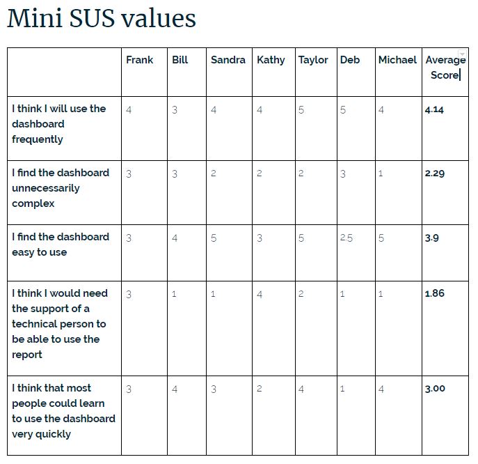
The interviews were conducted using open-ended questions about the user's experience with the dashboards. These were all self-reported interviews. We were unable to perform studies of the participants actually using the dashboards and recording their behavior due to budget and time constraints. To add a way to quantitatively measure the success of the dashboards, we used a mini System Usability Survey (SUS), which consisted of 5 questions that participants self-identified on a scale of 0 - 5 at the end of each interview.
The questions:
- I think I will use the dashboard frequently
- I find the dashboard unnecessarily complex
- I find the dashboard easy to use
- I think I would need the support of a technical person to be able to use the dashboard
- I think that most people could learn to use the dashboard very quickly
The Problems / Challenges
The dashboards were built in Google Sheets because it was quick and easy. However, the main goal was to have the dashboards live in Drupal (their CMS), which was connected to their reporting tool - SuperSet. While open-source and very powerful, SuperSet lacked a lot of functionality in terms of design. All the styling had to be coded in CSS, which for the purposes of our prototype wasn’t practical.
The limited budget restricted the testing methods we could use to gain insights. Additionally, our testing pool was rather small and because of the length of the overall project (about 6 months), we lost several testers throughout the testing period. We would have loved to use testing tools like usertesting.com to record users doing tasks instead of relying on the user's recollection; however, it just wasn't an option due to these restrictions.
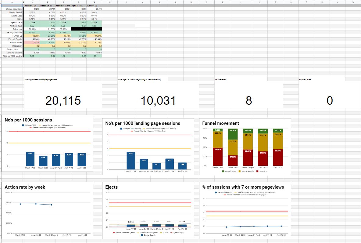
Second Iteration of the Dashboards
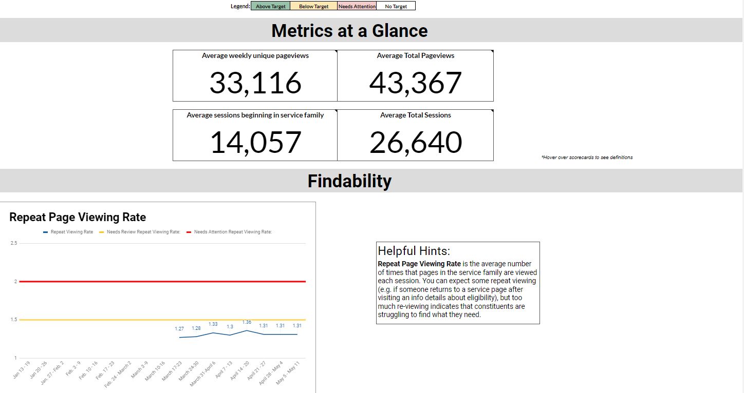
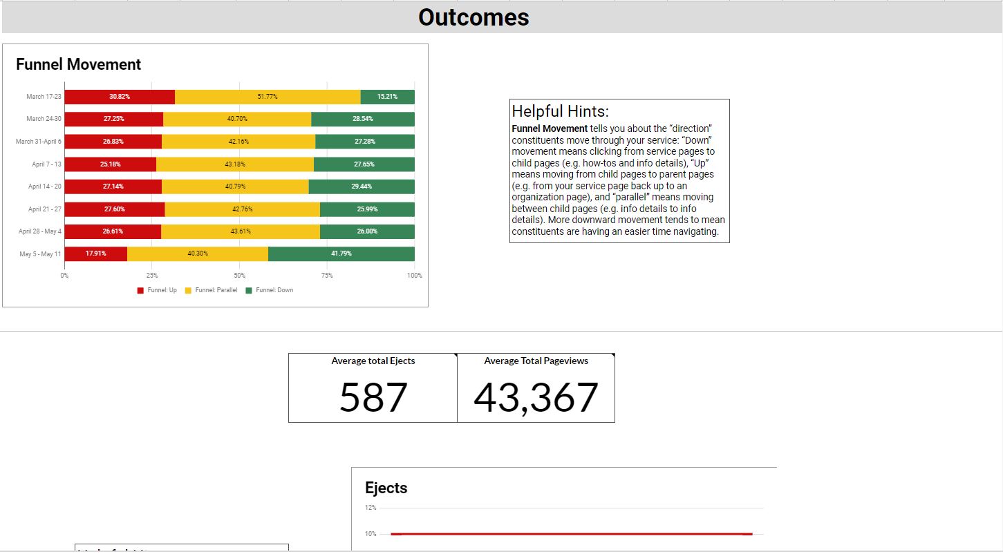
After analyzing the data from the first two interviews, I began the redesign which was still limited to Google Sheets. I interviewed the users again, and many noted that they felt the dashboards were easier to understand and more visually appealing, which I believe made it feel more approachable and digestible. Users also loved the addition of the Helpful Hints, which I added to help increase the level of understanding for those who were uncomfortable with data analysis.
Final Interview Analysis
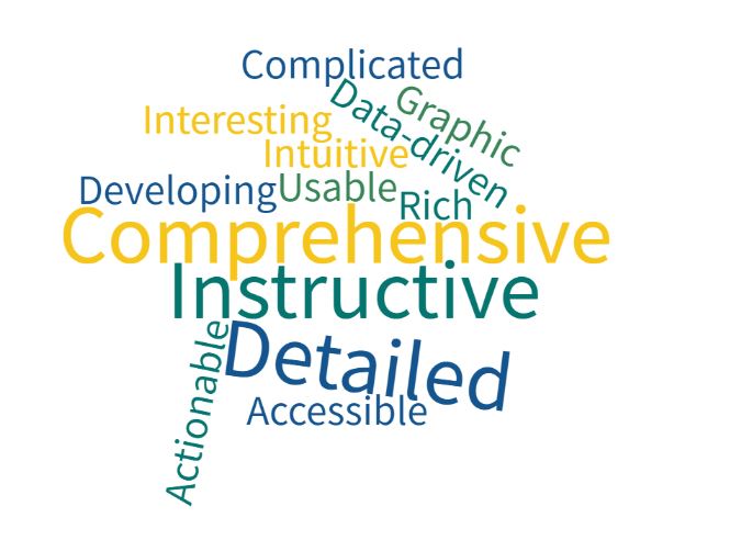
To wrap up the project, we conducted final interviews and started analyzing the data across all three interviews. Many interviewees were pleased with the progress the dashboard had made and reported using the dashboard more often. We asked them to describe the dashboard in three words, which we took and made the word cloud below.
Final Mini-SUS Analysis
Final min-SUS scores showed increases in the positive questions (ease of use and frequency of use) and decrease in the negative questions (complexity and technical support). There was a decrease in how easily people felt others could learn the dashboard, but we believe this is because some additional new metrics were added between the second and final interview, which were more complicated.
Most Helpful Dashboard Updates According to Interviewees
- Visual Updates
- Addition of conditional formatting to the table
- Graphics for data visualization
- Addition of threshold lines
- Application pages being included in traffic
- Helpful Hints
- Trended view
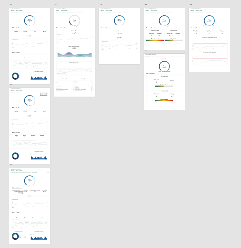
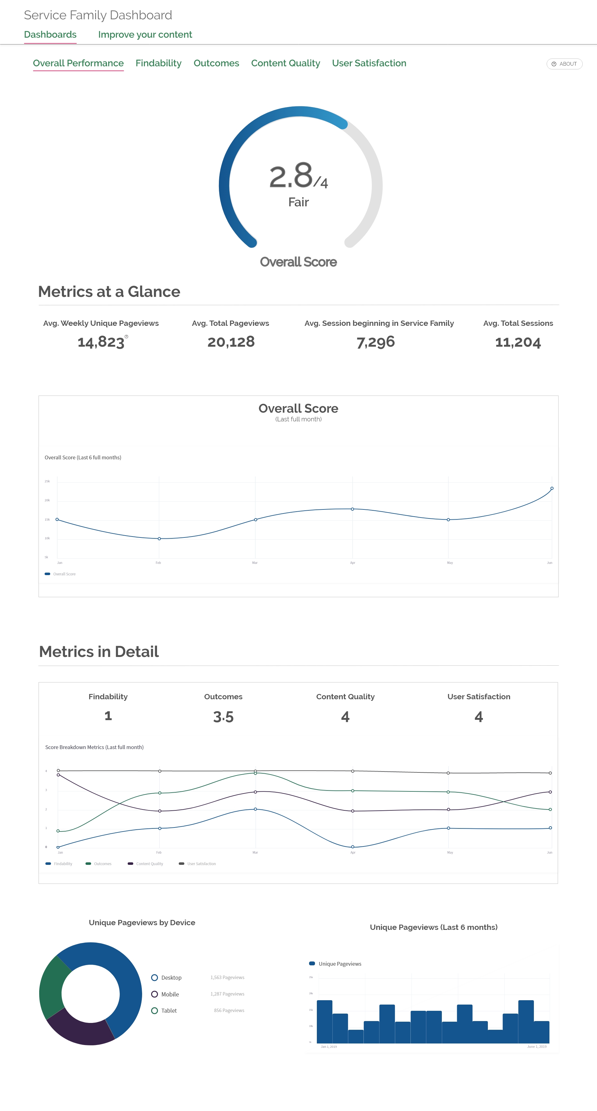
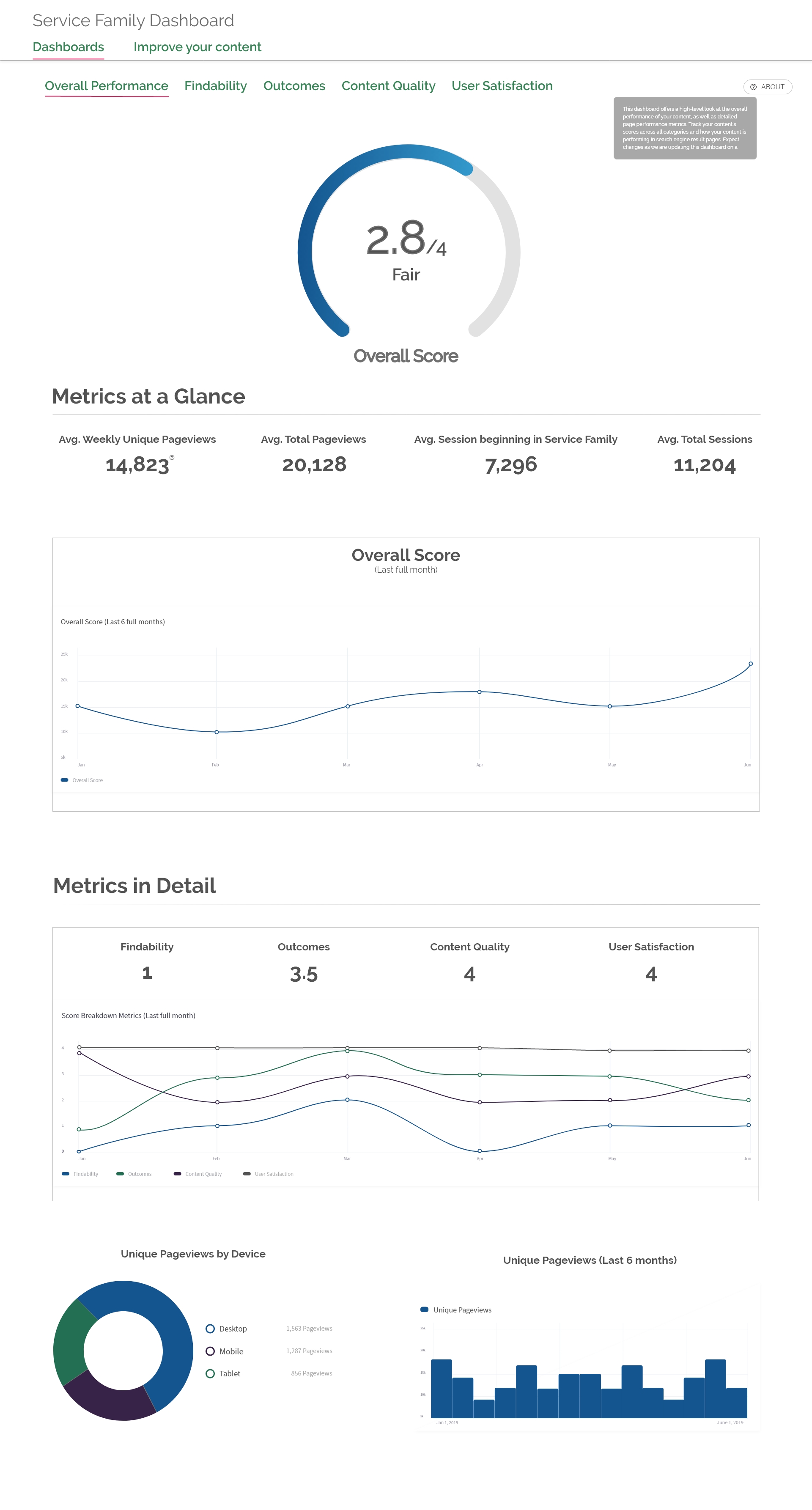
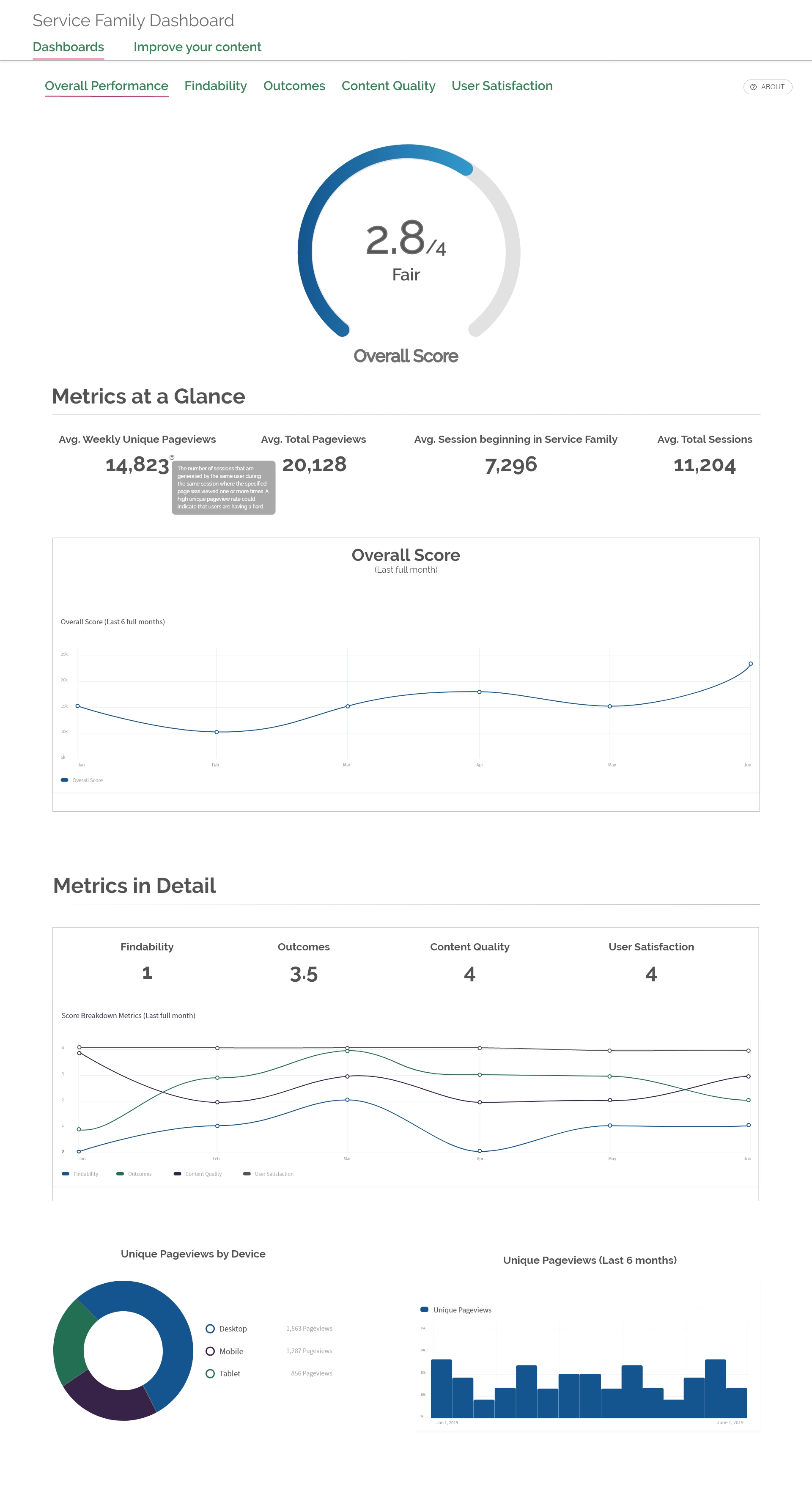
Final Dashboard Design
Even though the project was technically over, I was asked to brainstorm what a “pie-in-the-sky” iteration could look like. I wanted to dream big, but also be realistic about the limitations of SuperSet. I tried to put together something that was approachable, easy to understand, and intuitive.
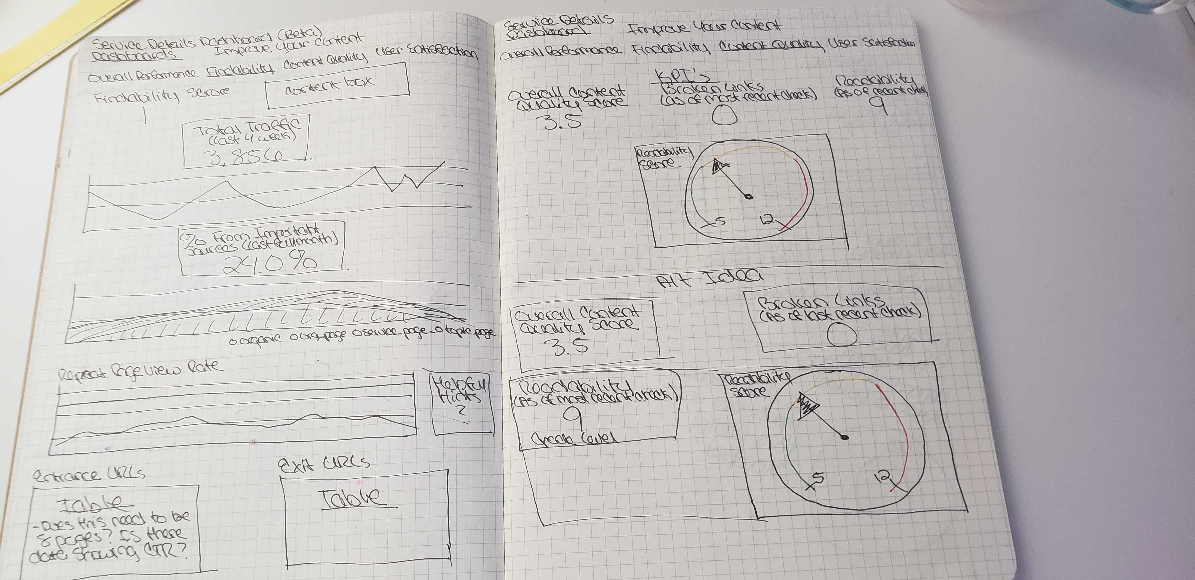
After sketching and prototyping all screens, I handed them over to the client. The major changes I made to the design included converting the “Helpful Hint” boxes into tooltips to make them less intrusive, adding branded colors (which had to be altered for accessibility), and changing data visualizations. The client, and main stakeholder, said to me:
“If I can make something that even remotely looks like this I will be so happy.”-Product Owner and Main Stakeholder
Summary
Overall, I was really happy with the way this project turned out. While we were limited in our tools and methods, we were still able to gain a lot of insights about user’s data needs. There’s a lot I wish we could have done differently, but we were still able to make a positive impact on people’s daily lives. The dashboards we created make data more accessible and digestible, and helps content writers and web editors make data-driven decisions. And in turn, their creation and delivery of better content to citizen’s makes their lives a little bit brighter.