The Background
As a community college in New York City, our client was under a lot of pressure to attract top talent. They came to us looking for a website redesign and knew their navigation structure was a big complaint. They had conducted recent surveys with students, parents, employees, and website visitors and found that almost everyone had trouble finding relevant information on their website.
They wanted this site in 6 months, and designs needed to be finalized within 2 months. This was a very large site so 6 months was a quick turn around. Not only were we trying to design a site to assist current and prospecting students, parents, and visitors - we also had to consider employees of the university and departments competing to feature their school. While we would have loved to use a tool like TreeJack or another navigation testing tool, we had to rely on survey data and best practices to inform the information architecture.
The Process
With all the past survey data I could get my hands on, I combed through it to find the largest complaints and most commonly problematic areas of the website. Due to lack of testing data, I used a Nielsen Norman Group best practice guide on University sites, which covered navigation, to further my research. Additionally, I looked at top competitors to see what they did well, but also what we could do better.
According to the survey data, most respondents had trouble finding or wanted quicker access to site sections such as:
- Specific School curriculum
- Admission requirements (both overall or for a specific school)
- Registrar
- Quick access to things like maps and portal links
Empathizing
To better understand the survey respondents who struggled with the navigation, I gave myself a series of common tasks. I tried to navigate through the site to achieve these goals and noted my experience along the way.
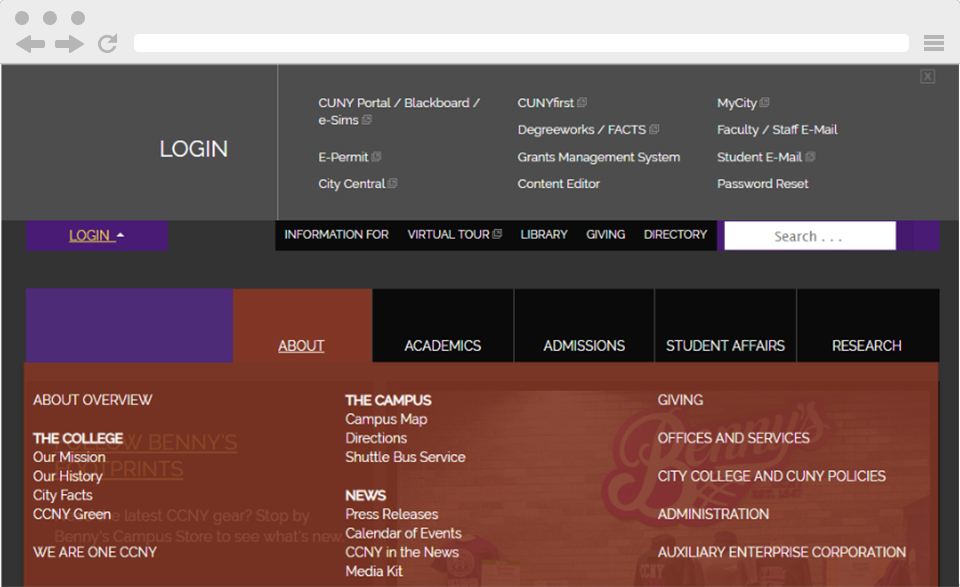
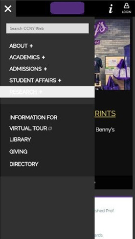
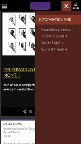
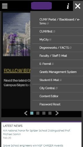
I found that in general, some of the major problems I had were due to the sheer size of the menus. The main navigation was cluttered and difficult to read due to its overlay. A large majority of sidebar menus contained 20+ links and extended well below most main page content. It was simply overwhelming to find anything and presented far too many choices for how to get there. Additionally, the lack of breadcrumbs on deeper pages made it difficult to navigate back and forced you into using the cumbersome navigation.
Organizing
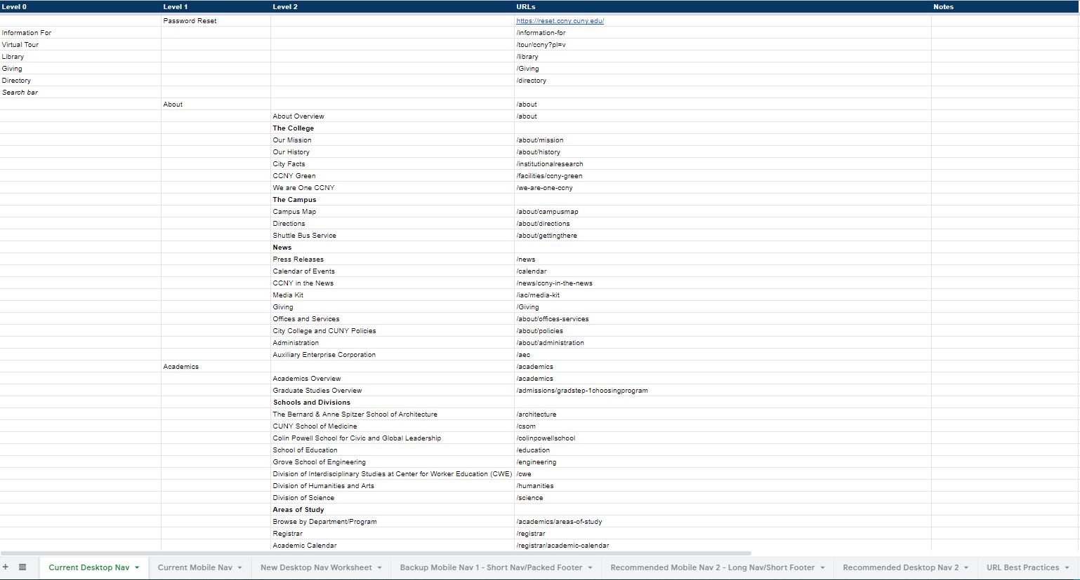
In order to see the whole navigation laid out and systematically compare it with the 4 other navigations on the site, I broke out the spreadsheets. I mapped navigation for desktop and mobile on seperate tabs for the main navigation, utility navigation, sidebars, and footer.
I then highlighted each duplication and made notes of how we could consolidate pages to remove weak content that didn’t serve the users needs, and better match with the most common user journeys and paths.
Collaborating
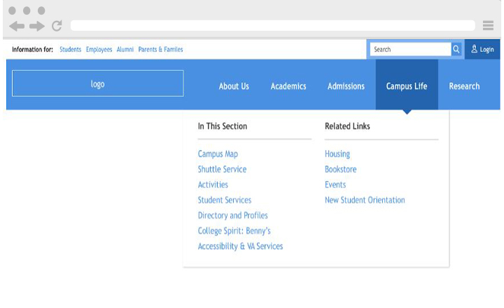
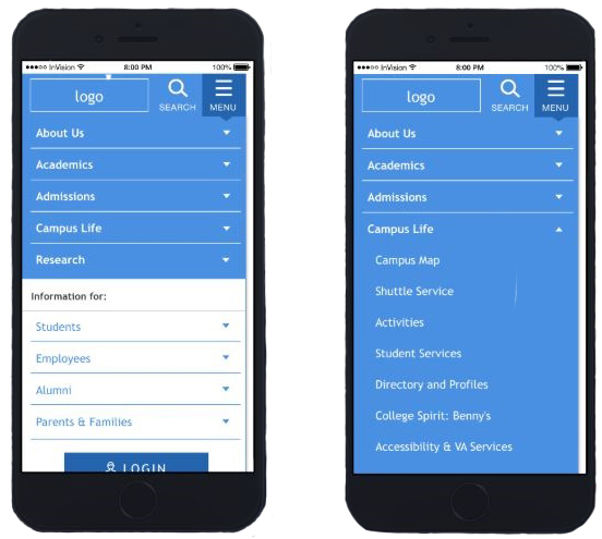
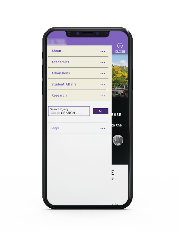
Once I had an idea of how I thought the navigation should be laid out, I wanted to gut check off the designer on my team. I quickly put my thoughts in Sketch and sent them over. We made a few small tweaks and presented to the client who had originally wanted a mega menu with flyouts. We were able to demonstrate another option and convinced them this one better served their users needs.
Outcomes
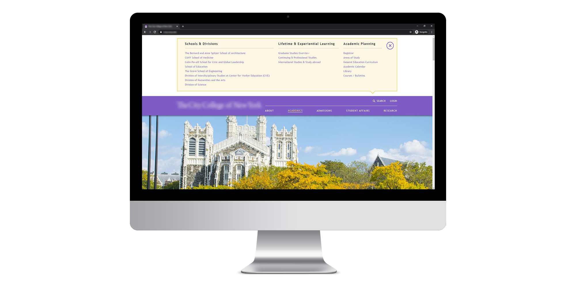
After the information architecture had been approved, I moved on to other projects while full mockups were being designed. While there were some design changes that affected the function of the navigation, it overall stayed mostly the same. We felt the final product took the most common user journeys into account better than the previous navigation and matched typical mental frameworks.
We’re still waiting on post-launch survey data to confirm that our various users are having an easier time navigating the site (sadly we weren't able to lead or assist with this research).
Summary
Overall, I’m really glad to have gotten to work on this project. It was a complicated problem to solve with unique challenges. I do wish that we had gotten to play a part in both pre and post-launch user testing and gotten to be more involved with the redesign throughout the course of the project. However, I think we were able to get something that was more functional, clean, and overall easier to use.


 Resume